Case Study
Save Destination Healthy Skin Logo Development
Client: The Skin Cancer Foundation
Industry: Non-Profit
Location: New York, NY
Mission: To educate the public about the different forms of skin cancer, and promotes and supports ongoing medical research into causes and treatment.
Introduction
Destination Healthy Skin (DHS) is The Skin Cancer Foundation’s free mobile skin cancer screening and education program.
Over the years, it has:
provided 32,000 free skin cancer screens.
identified more that 12,000 potential skin cancers (including 550 suspected melanomas).
distributed free skin cancer educational materials and sun protection products to over 100,000 people.
Unfortunately, the DHS RV needed to be replaced. The RV was 14 years old, had traveled 150,000 miles, and was getting more and more expensive to maintain. Replacing the RV for the 2025 season would keep free skin cancer screenings going strong for years to come. Therefore, the Skin Cancer Foundation needed to launch a new fundraising campaign, titled “Save Destination Healthy Skin,” starting with a logo and followed with a branding package.
Objectives
Create a Brand
Create a consistent and engaging brand that reflects the mission of the Save the DHS campaign through various mediums. Needs to incorporate existing DHS brand—logo, fonts, and colors.
Inspire Involvement
Increase awareness and engagement through branding that honored the past accomplishments of the program, but also looked towards the future.
Attract Funding
Appeal to potential donors and supporters by presenting an engaging look and feel and created a sense of urgency.
The Process
Discuss
Facilitated a discovery meeting with The Skin Cancer Foundation team to gather ideas and concepts and establish a timeframe.
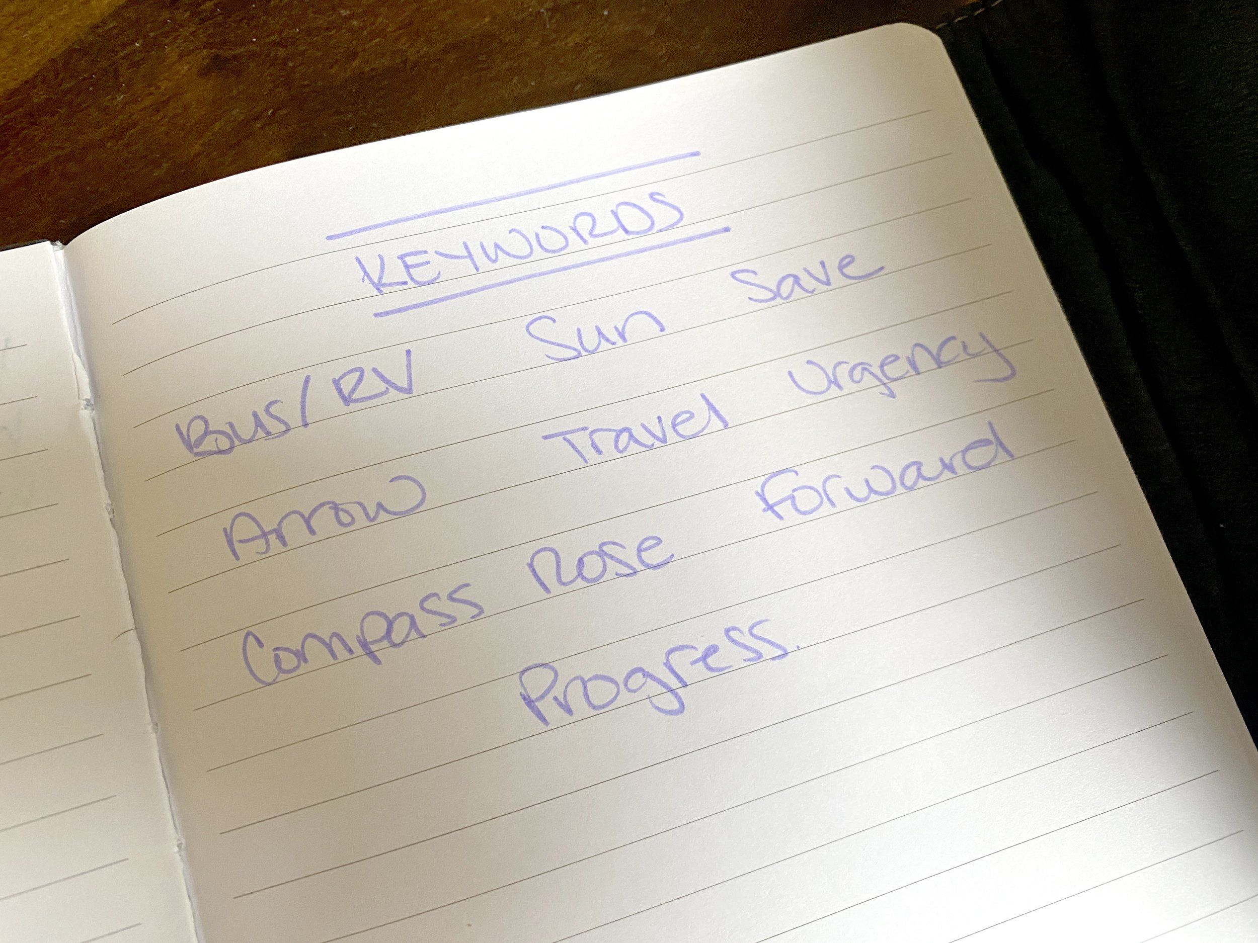
Identified keywords: bus/RV, sun, arrow, compass rose, travel, urgency, progress, forward, save to guide the creative direction.
Reviewed must-haves: Incorporate current Destination Healthy Skin logo and color scheme, horizontal and vertical versions, call -to-action version.
Discover
Conducted design discovery research into brand strategies of similar campaigns and images related to the keywords.
Created and presented a moodboard to make sure we were all on the same page.
Identified commitment to concepts that conveyed positivity and forward motion.
Determined preferred iconography of busses, arrows, and rising suns.
Design
Created and presented three logo concepts to stakeholders for feedback.
The team chose to move forward with the third logo option (arrows blending with the RV mark) but wanted to see the mark modified to in the RV icon to include the back side. New logo was presented for feedback.
At that point, while the team liked the addition of the back side, I still thought the icon was missing balance. I suggested the addition of a back tire to be included in the next round. We also wanted to see the use a tertiary highlight color in a warm tone to allow the action word “Save” stand out more.
We settled on an orange color that was a complementary tone to the existing cool gradient palette. This color, we felt, inspired engagement and action.
With the vertical format finalized, we moved on to creating a version that included a donation call-to-action banner at the bottom. The banner used the same complementary orange to create visual framing of the logo at the top and bottom.
Deliver
Finalized the logo that featured simplistic illustration of an RV with integrated arrows, symbolizing movement and progress and used bright colors that inspire engagement and hope.
Created the logo in several versions for different applications with black, white, and full color options.
Included a Branding Sheet in final package that noted the color builds, fonts, and logo versions on light and dark backgrounds.


